Products You May Like

We’re teeing off another edition of Box Art Brawl!
Before we do so, however, let’s take a look at what happened on the last hole. It was a par three as we matched up a trio of covers for Mario & Luigi: Partners in Time. Unfortunately, some strong winds seemed to blow things firmly in the favour of North America, whose bright cover took 75% of the vote, leaving the Japanese and South Korean variants to putt 14% and 10% respectively.
Onto this week’s course and while our puns might have a fairway to go, we’re taking a swing at Mario Golf on the Game Boy Color to celebrate its arrival on the Nintendo Switch Online library. We previously looked at the N64 version when that landed on NSO and did the same for Advance Tour, but this pretty portable variant had a couple of regional covers of its own so we thought it only right to take it to the green.
There are only two different covers this time around, with Europe and North America sharing a similar design. But enough warm-up, let’s get to it. Four!
Be sure to cast your votes in the poll below; but first, let’s check out the box art designs themselves.
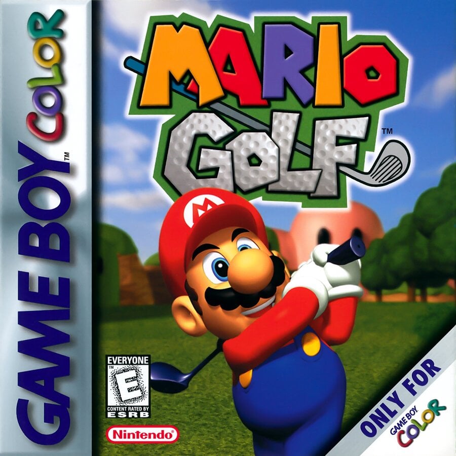
North America / Europe

Now this is very much in line with the Mario Golf series that we all know and love. Mario stands centre stage — the same model as we see on the N64 cover — with his club extended over his shoulder after hitting what we can only assume was a belter of a shot (he looks happy enough about it, at least). The logo sits overhead while the course setting blurs into the background. It’s simple, but it’s effective.
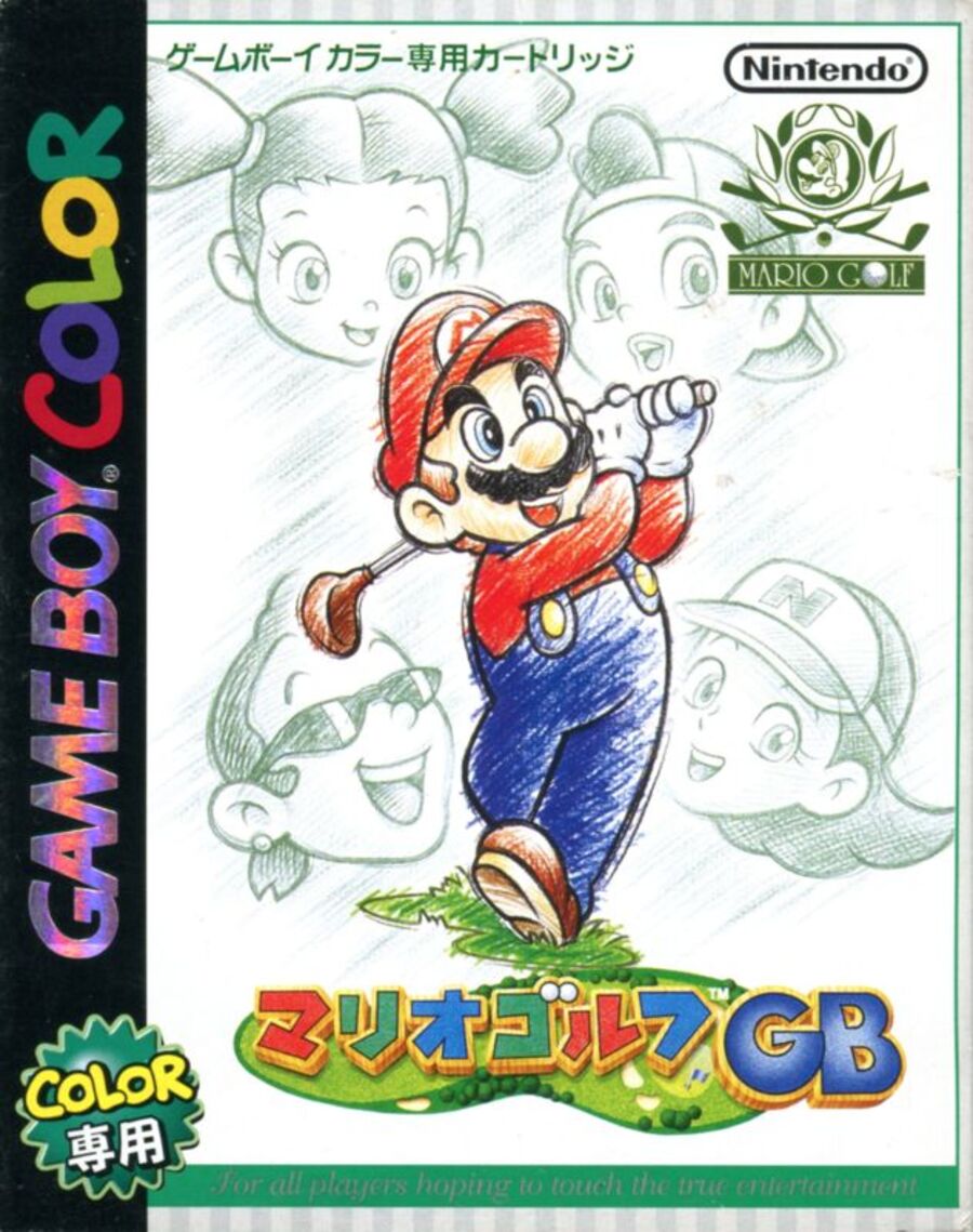
Japan

This is a very different approach, but we’d be lying if we said we weren’t intrigued. Japan’s cover (called ‘Mario Golf GB‘ in the region) opts for a more paired-back design than the Western variant, with a sketched aesthetic for Mario and his fellow golfers, whose giant heads float in the background. It’s understated, but it’s nice.
Thanks for voting! We’ll see you next time for another round of the Box Art Brawl.


