Products You May Like
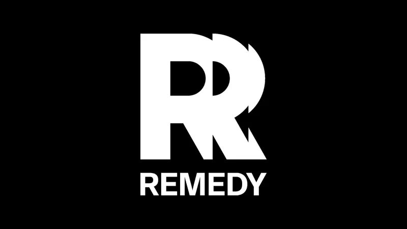
Remedy Entertainment has revealed a new company logo, and fans of the letter R are sure to be pleased as punch.
It’s been 20 years since Remedy updated its logo, but above is the image that will appear on the studio’s projects going forward. That includes Alan Wake II, a yet-to-be-revealed Control sequel, a Control multiplayer title, and remakes of Max Payne 1 and 2. The previous logo was pretty much just the letter R too, but this one has a different font and kind of hurts our eyes looking at it.
In a blog post, Remedy gives its simple rationale for the update:
“The bullet in the letter R in the old logo represented the era of Max Payne, but the Remedy of now is much bigger than a single game; we have a whole portfolio of games, new and old.
It was time to update and redefine our visual identity to bring more consistency, showcase our evolution over the years, and better express our vision of today’s Remedy.”
So there you have it. What do you think of Remedy’s new logo? Let us know in the comments.
